Tips for Magento eCommerce Product Detail Pages (PDP) & Category Pages

- Magento brings a lot of powerful tools to the marketing table that your business can leverage to attract more customers.
- Consumers have more ways to shop in the digital age than ever before. The only way to keep up with the ever-growing nature of eCommerce is to lean into the consumer's voice.
- By providing a unique tactile experience, made possible by Magento, you can convert more and more customers - and keep them returning to you again in the future.
In this Article
Best Practices for Magento eCommerce Product Detail Pages and Category Pages
Magento is an open-source marketing platform initially developed by Varien, Inc. According to its Wikipedia page, Magento officially started development in early 2007. Seven months later, on August 31, 2007, the first public beta version was released.
Varien, the company owning Magento formerly worked with osCommerce. Varien had initially planned to fork osCommerce but later decided to rewrite it as Magento. In the first years of its existence, the platform had been the winner of the “Best of Open Source Software Awards” and “SourceForge Community Choice Awards” several times.
In February 2011, eBay announced it had made an investment in Magento in 2010, worth a 49% ownership share of the company. On June 6, 2011, eBay announced that it would be acquiring the rest of Magento, which would join its new X.Commerce initiative. Magento’s CEO and co-founder Roy Rubin wrote on the Magento blog that “Magento will continue to operate out of Los Angeles, with Yoav Kutner and me as its leaders.”
Magento has continued to be a leader in eCommerce software since and has only continued to improve functionality.
The platform exists to streamline the process of delivering marketing material to product marketplaces and assists in improving their websites right out of the box.
The eCommerce world is highly competitive. To stay ahead, retailers are looking for new and innovative ways to stand out to buyers so that they can clinch the sale. Whenever a customer lands on your website, the goal is always to keep them there if possible.
Every eCommerce retailer wants to push to finalize the purchase. To make the sale, websites must be exciting and intriguing to grab the buyer’s attention. Typically, if a would-be buyer avoids the site to look elsewhere, they rarely return, and you lose the sale.

Emerging Trends & eCommerce Product Page Design Best Practices
Web design has been about responsive, adaptable, and functional plans in the past. However, as mobile capabilities have become more sophisticated, there has been an increased focus on immersion, personalization, and aesthetics.
With each passing decade, we have seen how visual merchandising and marketing have changed to meet consumers’ expectations in advertising and how they like to consume it. Think of advertisements when you were young; an ad that comes to my mind is an early two thousand commercial for the Mercedes Benz M Class, a mid-size SUV.
The Mercedes Benz M Class is shown in an ambulance version in the commercial. With sirens blaring through an unknown European city, the ambulance passes through an underground tunnel emerging from the other side as a regular SUV with a family as its passengers, evoking a sense of safety and protection, along with the trademark quality is expected from the German automaker.

Bold color choices
eCommerce platforms of today are, first and foremost, characterized by bold colors and bright, gradient patterns. Following the resurgence of Y2K aesthetics in popular culture, it is no surprise that online retailers are choosing bright, bold, and enticing color schemes that match the sensibilities of young consumers. With the broad aesthetic appeal, these colorful designs feel less severe and more inviting than traditional eCommerce sites.
Color psychology studies how different colors determine human behavior. The psychology of color is used in advertising and marketing to evoke emotional reactions. That sounds simple at first blush, but there’s a lot to unpack in that statement.
Before we look at how color meaning affects human behavior (and how specific colors elicit different reactions), let’s take a quick journey through the history of color.
In the 17th century, Sir Isaac Newton observed sunlight passing through a glass prism and how the light was reflected into various colors. He initially identified six wavelength shades: red, orange, yellow, green, blue, and violet. He later added indigo, according to Wikipedia.
But color psychology predates Newton’s time by thousands of years, returning to the Egyptians. They studied color’s effect on mood and used paint to accomplish holistic benefits.
Swiss psychiatrist Carl Jung called color the “mother tongue of the subconscious.” His psychological studies led him to develop art therapy. He believed that self-expression through images and colors could help patients recover from trauma or distress.
Color meaning and the psychology of colors can powerfully impact people’s behavior and decision-making. People make subconscious judgments about a person, environment, or product within seconds or minutes. Color plays into this initial impression.
That fact is not lost on brands and advertisers. They know specific colors, tints, hues, and shades evoke emotion and move people to action. This effect is both subtle and powerful.

Artful photography
In conclusion, these fun, bright online spaces indicate how eCommerce is becoming increasingly creative in its ideas and presentation. Magento web design agencies are using artful photography more and more frequently to help online retailers showcase their products in edgier, more inventive ways. The effective use of illustration set designs, and diverse model casting has increased user engagement.
With enhanced abilities, Magento 2 helps designers create these on-trend visuals using 3D mapping and digital visualization. Magento’s online store platform can seamlessly embed these images, allowing customers to view products in memorable and attractive ways. High-quality product images can significantly impact a customer’s buying decision by presenting the product in the best possible light.
Magento can also be combined with a Digital Asset Management or DAM solution to maintain your digital assets and different versions, a change history, and resizing tools right under the hood.

Bringing back brutalism
On-trend aesthetics have become an essential asset for eCommerce platforms looking to sell products in more ‘fashionable’ sectors. An effective combination of color, artful photography, and brutalist design has become increasingly valuable to retailers using Magento as consumers respond to optically exciting and visually intuitive designs over the last year.
Brutalist designs are structurally helpful, with clear, straight lines drawing the eye and directing consumers to the product or service they require. Combining the high-art feel of more stylized web design with functionality has been particularly successful for luxury brands using Magento.
By using the tools within Magento, developing a clear and consistent brand identity is a walk in the park. Creating an identity that consumers can recognize allows them to build trust within your brand and also assists them in knowing that they have made it to the right place when finding the products they are looking for. Product detail page design becomes crucial here, ensuring all relevant information about the specific product is presented clearly.
Engaging the user
Magento’s ability to tap into the zeitgeist has also helped it create a variety of more informal spaces for consumers to come and shop in. These changes are in sync with the post-pandemic trend of corporate casualization, which saw companies interacting with their consumers more relatable.
Like most apparel retailers, Levi Strauss & Co.’s (LS&Co.) second quarter of 2020 was defined by the coronavirus pandemic and the economic fallout. The company slashed 15 percent of its global non-retail and non-manufacturing workforce and suffered a $364 million net loss for that quarter.
But there are glimmers of hope and opportunity as Levi’s finds its omnichannel grove and consumers return with new values that resonate with timeless and enduring denim.
In an earnings call, LS&Co. CEO and president Chip Bergh said the company was “cautiously optimistic” about its trends at reopened stores and its eCommerce business. The company had roughly 90 percent of its stores opened globally, and performance during the reopening phase tracked better than expected. This showcases the importance of a well-designed product listing page that can drive conversion even in challenging times.
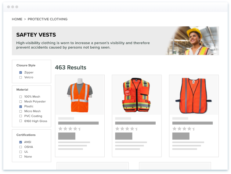
By providing more ways to interact with the company, Levi Strauss could keep their business afloat and ensure a bright future. Features like breadcrumb navigation, detailed product descriptions, and clear product titles help users find what they need quickly and make an informed buying decision. Including CTA buttons strategically can guide customers towards desired actions, enhancing conversion rates.
Customization and personalization
This is just one approach designers use Magento PIM to individualize the eCommerce experience. Magento platforms can also restructure with numerous personalization features to include more significant and prominent design elements based on the consumer’s age, habits, and visual capability.
A PIM software or Product Information Management software makes tailoring the customer experience to target different marketplaces easier. By leveraging channel management with a product management tool, you can customize what attributes are sent to other marketplaces while keeping them accurate and tailored to your business needs.
Inclusivity is, of course, vital for designers working with Magento. The platforms need to be malleable so that customers with limited color ranges, or decreased sight, can enjoy a seamless user experience.
Moving images
Video integration is another effective way of creating an enticing and accessible space. A prevalent trend throughout 2022, product videos are becoming increasingly valuable to eCommerce websites as a quick way of engaging consumers and summarizing the brand experience.
Since customers are shopping online instead of being in a physical store, providing the illusion of a tactile shopping experience is essential. Using multimedia and product imagery allows for this experience, and tapping into new multimedia marketing platforms enables you to reach new audiences that you may not have before.
Videos are also practical multimedia resources. They are an easy way of incorporating sound design and music into an eCommerce space. Audio capabilities also mean that consumers don’t have to dedicate time and energy to reading large amounts of text, making the experience faster, simpler, and more openly accessible. In keeping with web design trends that embrace creativity and artistry, short films have become one of Magento’s most popular consumer engagement tools.

Reviews and testimonials
Increasingly, the user experience is being given a voice on eCommerce platforms. With some recent surveys indicating that more than 80 percent of consumers consider reviews on individual product an essential resource for online shopping, it comes as no surprise that almost every Magento eCommerce platform includes a space for testimonials and customer feedback.
We’ve all been there. You stumble upon a new product that is unfamiliar to you. After reviewing the attributes displayed with the product, a common next step is to find the review section to see if there is anything that you should be made aware of before purchase.
Reviews create an internal dialogue between consumers of the same brand. Giving users a space to interact directly with one another provides eCommerce platforms with a sense of transparency, which, according to Magento’s agency trends, increases the likelihood of repeat custom.
Simplify your User Interface (UI)
The user interface on mobile is a bit trickier since mobile devices tend to have smaller screens. You have a small space to work with, so keep it simple for every product UI. Even if you are tempted to tell everyone everything you have and show them all the cool photos, you probably should not take up all the white space.
The ability to distinguish a website’s elements on a mobile user interface is how you help your customers find what they want.
Micro-interactions
Two-way engagement has become so popular on Magento’s eCommerce platforms that it has led to the rise of micro-interactions. These small moments of animation are prompted into action by user input; for example, you can hover over a particular section of a website, and that heading will change color or move to display a relevant image. Micro-interactions are popular because they offer Magento’s designers a lot of freedom to create new dialogues with users in the same novel and informal way as other contemporary trends.
Remove Visual Carousels
They are visually attractive, but you probably do not want one on mobile because it can confuse users. A carousel animation CSS can ruin an interface, as in the case of Bed, Bath, and Beyond, where they have a carousel, but the interface cannot tell when users are trying to do a carousel swipe when they want to get to the shopping cart.
That is anecdotal, but the point remains that blocks of information work better than carousels. People tend to scroll on their phones, so animated moving parts are not advisable.

Additional Tips
To further boost engagement, integrating product videos and product recommendations on the product detail page can offer a more immersive shopping experience. Ensuring product availability and offering multiple shipping options can also improve customer satisfaction.
Combining SEO strategies with these design principles ensures that your web page on an eCommerce platform ranks well in search results, driving more organic traffic. Social proof, such as customer reviews and ratings, can also influence buying decisions positively. Utilizing upsell techniques on the product detail page can increase the average order value by suggesting complementary products.
The purpose of a product detail page is not only to provide information about a particular product but also to engage and convert visitors into customers through strategic design and functionality. Effective page layout and navigation, combined with relevant product attributes and high-quality images, can significantly enhance the user experience and drive sales.
Key Takeaways
In conclusion, by diving into the capabilities of Magento, you can create a memorable customer experience for your customers as to exactly what they’re looking for that not only meets their needs in finding what information they need, but they will also be able to get a sense of your brand in a virtual setting.
Magento is a powerful tool that will allow you to connect with your customers and ensure that your marketing plans are executed appropriately. Magneto eCommerce development is an excellent platform with lots of key features and benefits.
According to your needs and requirements, you can create your eCommerce website with Magento, one of the most flexible and feature-rich platforms to create a website.
Start your free trial of Catsy PIM and DAM software today.
Yes! With good digital asset management (DAM) solution, you can store all your products and their data in one place and make them available to your team for easy access and retrieval. With the Catsy DAM system, you can search for your files based on tags, descriptions, and categories. You can also manage your files through a simple interface without spending hours on the backend.
In a business that relies on partnerships with retailers and distributors, accurate and consistent product data is critical to success. Using a DAM system, you can provide your partners with a one-stop library of all your products. The users can search for a product by its SKU, ID, name, or other identifiers. This helps you to stand out as the best partner to your clients.
With the rise of social media, companies can better target and attract their customers with visual content. For example, a 2D product configurator allows a browser to swap out various watch features to see what it’ll look like on its wrist. This personalized experience can increase a brand’s perceived value and encourage sales. It’s a powerful strategy that enables marketers to reach consumers where they are already spending a lot of time.
The first step to implementing visual commerce is to have more images and videos. These are highly attractive and encourage a customer to buy the product. However, this isn’t the only way to achieve the goal of visual commerce. By using multiple media, a retailer can create a compelling visual experience and boost sales.
Yes. They are a great way to interact with your visitors. And these images can be free if you use a smartphone to capture them. The first step in using 360-degree photos is to create a product that is aesthetically pleasing to your visitors. This is possible by incorporating an interactive video or a virtual tour. For example, you can let your audience spin a product and see how it looks before they buy it.
Similarly, you can add a hologram to your listing that allows your visitors to see the products in 360 degrees. This will allow them to preview the products and decide if they want to buy the product.
Once you have your virtual tour ready, you can begin using 360-degree photos on your website. This type of photography will help you sell more products.
Whether a video should be short or long depends on the content. For example, an explainer video might be rude, but you can go longer if the goal is to educate your audience. In this case, you can spend a few minutes talking about the benefits of your product. If you target top-funnel leads, a video of four to 20 minutes may be adequate.
A successful B2B video should not be long enough to overwhelm your audience. Ideally, your video should be no more than five minutes long. Keep in mind that you should tailor videos to your audience. Make sure it’s not too technical.
Yes. More than 82% of business websites will use some form of video on their homepages. And while many businesses are using video for marketing purposes, not all of them maximize their potential. Creating an engaging caption will help make your video more likely to be shared by most Internet users.
The importance of captions for video content cannot be understated. The average internet user will read the caption before watching the video.
Yes. When it comes to B2B marketing, there are a few skills that every business should invest in. One of the most important is knowing the product or service you are trying to sell. You should see the product or service inside and out. You should be able to answer questions convincingly and gain the respect of potential customers. The best way to acquire this skill is to try out different versions of the products or services in your company.
Yes. This is the foundation of your customer-centered marketing. It allows you to understand your target audience better. This is particularly useful for companies selling products. When creating a persona, you should consider what your target customers are looking for. The more detailed and realistic a buyer persona is, the more effective your marketing campaign will be. And a buyer’s persona can be developed for each industry.
First, you should define your target audience. This includes their demographics, challenges, and aspirations. Similarly, your buyer persona should include information about how your product or brand can make their life easier. Then, you can give them a name, too. Your buyer persona could be a working mum in her 30s named Jessie. She may enjoy outdoor activities, etc. Ultimately, your persona should reflect your target audience’s needs.
Yes. One of the essential benefits of tailored product content is increasing customer engagement and making your product more relevant to them. It also helps you establish credibility by generating buzz about your brand. Its benefits include building long-term relationships with customers, resulting in repeat business and brand ambassadors. Furthermore, with a customized experience, first-time customers are more likely to stick around for longer.
The first step to creating tailored product content is understanding your customers’ preferences. Secondly, tailor your content to the buyer’s persona. Buyer personas are a collection of ideal customers with a particular profile and buying behavior. If your content fails to attract your ideal customers, you’re probably not making sales.


