Combining text and images on banner pages or marketing material can be a complicated feat but is totally do-able with the right tricks in your tool belt. In this post we tackle images that are complex and have a lot of contrast with some skilled typography. Here are 8 ways to maximize readability and make all of your type on image dreams come true.

1. Cutout The Background
If you have product photography you want to showcase, cutting out the background and adding a gradient can be a great option. Adding a subtle gradient in the background makes it easy to use typography that is bold or subtle and also compliments the image. In this example the text and gradient are shades of a grey-ish brown to bring some subtle color into the seemingly monochromatic image.

2. Creative Cropping
This original image featured more of the large white pill container along with the pills and dark background you see in this version. Because there was so much going on in the original, this image would be pretty difficult to use. By cropping the pill bottle most of the way out it was super easy to use white text and add a simple thick line to ground the text to the image.
3. Make the Text Part of the Image
Cutting out part of the letterforms to combine text with the image is a creative way to create visual interest and unite the text with the photography. This can be an especially great effect with product photography. One helpful trick for using this effect is using big and bold text. Condensed fonts are also a super great option because they allow you to make the text bigger and more impactful without them getting too wide.

4. Use a Color Overlay
Some images are super tricky, but can be tamed down with a bright and engaging color overlay. Color overlays work because they remove the white in photos therefore reducing the contrast. Using either large white or complimentary color for the text will help maximize contrast and readability. In this example the opacity of the tennis ball yellow is at 65% so that the image can be still clearly seen.
5. Using Shapes
Using interesting shapes with text layered on top is a good way to create interesting images and make sure the text doesn’t look like it is floating. In this greyscale image the red shape brings in some color into the previously somewhat boring image, and provides a lot of contrast for the text.
6. Selective Focus
Selective focus, or blurring, can be a really great trick for setting type. This effect is especially great because it highlights the shoes and bicycle and is a great background for both the white and green text. This can be achieved in photoshop using the blur tool or simply by choosing a photograph that is already blurred.
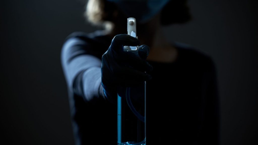
7. Blur and Darken the Image
Blurring and image and reducing the contrast works almost every time. Check out the difference between the original (bottom) picture, and the final version (top). The reflections and intense contrast would make it very difficult to introduce text into this photograph, but with some simple adjustments such as reducing the brightness, contrast, and adding Gaussian Blur in Photoshop, this image became totally usable.
8. Use the Grid
Using simple but interesting typography and aligning it with key parts of the photograph can be a great way to make a simple image look clean and crisp. As you can see, the middle of each E aligns with the horizon line, and creates a nice effect.